Pay Later In 30 Days & 3 Months Interest Free Or 12 Months With IwocaPay
Enjoy interest free payments for 30 days or 3 months, or spread the cost over 12 months on your Smart
Enjoy interest free payments for 30 days or 3 months, or spread the cost over 12 months on your Smart
An iconic symbol in the food world is the chef’s hat. This headpiece has become synonymous with cooking with its
Ensuring your venue stays legally compliant. If your catering or hospitality venue is situated in England or Wales, your signage
Available in a range of sizes, our brand new illuminated menu covers are all the rage. Our illuminated LED menu
Your menu cover should be flawless, just as the food you provide to your customers and using logos is a faster way to achieve that perfection.
There is a persistent misconception that the menu covers exclusively emphasises the menu provided by the restaurant,
But more observation reveals that the menu covers give information on the entire business operations, and that’s the primary reason you need a creative menu cover.

Restaurant branding is a great way to help your restaurant stand out from the crowd.
Simply put, “branding” helps to present the restaurant in a way that makes it stand out from the rest and makes everyone want to go there.
Customers are more likely to have a better appetite or want to make larger purchases when you present your menu with a stunning menu cover and a coordinated logo.
A well-designed menu cover aims to get the message into the reader’s head, increasing the chances of word-of-mouth marketing.
Pictures, designs, and words subconsciously stick in the observer’s mind and create a positive review of the place. This is one strong reason why you should have an attractive menu cover.
The ideal method to promote your company and provide customers with a memorable experience is to design a menu cover with your logo. Whether you use it as a takeout menu, a table tent, or a menu for your physical business, it is a great way to raise brand awareness.
Before you get started, make a few quick notes about everything you want your menu cover to include. Consider how much room you have and list everything you want to include. Once you have a clear idea of what you want on your menu cover, you can start planning your design.
People often use food and groceries as logos, but you can use tableware, a chef’s hat and apron, other kitchen tools, or an oven or stove to make a logo for a restaurant.
Picking a suitable colour is the most crucial part of making a logo. Choosing the right colours and shades gives the restaurant’s logo a purpose and makes it easy to remember.
A bright and colourful menu cover logo will stand out among other drab and colourless menu covers. Try to use bold, eye-catching colours, and make sure your design is vibrant and full of life.
If you use a font when making a logo, it should be easy to read, match the icon, and not have small details like fancy scrolls. Use fonts that are clean and simple.
If you have the skill, consider creating a unique layout that your customers will remember. While a simple design is effective, a creative design will make your menu cover stand out. If you don’t have the skill, don’t worry; get in touch with our team, and we’ll create a logo design tailored for you.
Although you want your menu cover to stand out, you want it to be easily understood. Consider keeping your design straightforward and uncluttered so your clients can see the information on your menu cover logo.

The Colors and shades should be able to catch customers’ eyeballs from a distance. A good logo should be straightforward.
Your logo can help customers refer to your brand; it should be easy to remember and recognisable by your customers after only a few glances.
Keep editing until everything that doesn’t belong is taken out. If you can take out a few flourishes here and there without making the design less attractive, that’s good.
It’s not enough for your logo to work now; it needs to work for you for a long
Constant changes will confuse your audience and make it harder for them to remember and recognise you, hurting your sales and income.
Consider the long term and create basic, robust designs that will last.
Your logo must stand out and should not be confused with that of a competitor logo must stand out and cannot be confused with that of a competitor. It should be personalised to you and your story.
A good logo should be positioned correctly for the purpose it serves. For instance, you should leave a meat picture out of the logo if it is for a vegan restaurant.
With so many marketing platforms to choose from, your logo must be adaptive to each one.
Different channels will affect different fonts, colours, and visuals in different ways, so your designer must offer something that works physically and digitally across all mediums.
Aside from shape symmetry, logo colours must complement one another. The majority of restaurant logos are only two colours. You may add more, but it becomes increasingly difficult to keep the design balanced.
Colour theory research can help you choose the perfect colours for your logo. Colours have many connections, and using the wrong ones might make it challenging to establish your branding.
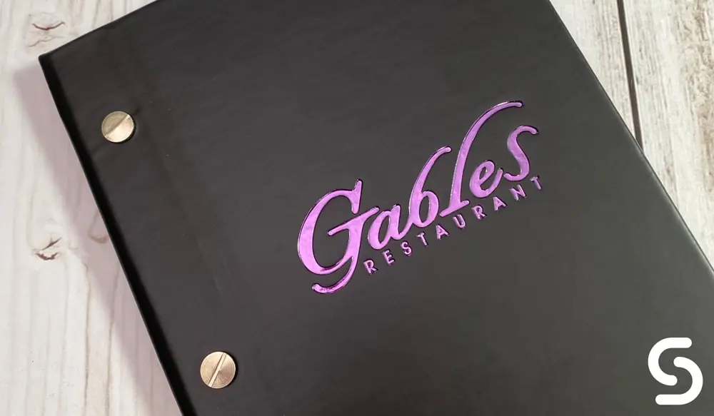
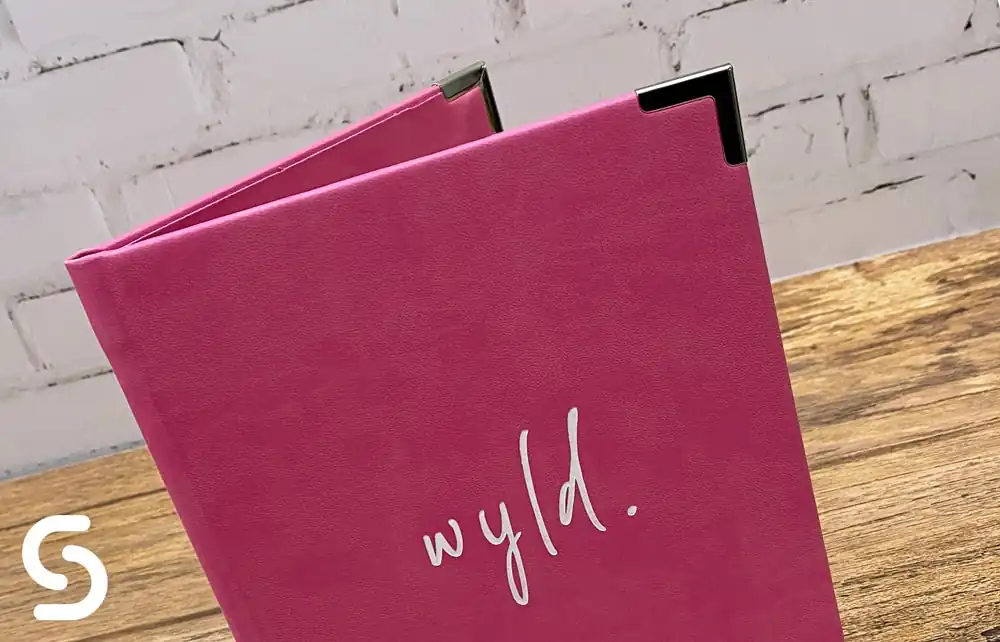
When designing your menu cover, include your logo prominently and in the proper location. Your logo should be clearly displayed on the menu cover so that people can quickly recognise it.
Although you have a few options for where to put your logo, the top-right corner is a more excellent position. Because the human eye is naturally drawn here first, this is the ideal location for your logo.
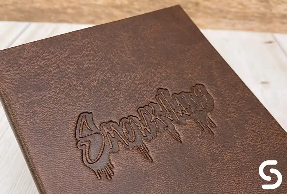
A final thing to think about and talk to our experts about is how the logo can be applied is going to be applied to the menu covers. We have two main options for applying artwork:
This is best if your logo is a single colour or is simplistic and there aren’t too many fine details. Any fine detail within the logo and it may not foil correctly.
Heavily textured materials such as a grained real leather or textured paper material, foiled will not take correctly and will look incomplete.

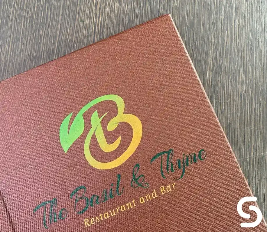
This artwork style is best if you have a multiple colours within the logo or fine details. As this is a print, you won’t lose out on logo quality however with won’t have the deboss effect you would get from the blocking plate. Materials this works best on include; Bonded Leather, Faux Leather (Vivella), Wood

Our in-house design team is here to assist you with the creation of professionally laid-out menu covers. We use various softwares for our design to ensure high quality, and our artwork and fixing methods are top-notch.
We can design the graphics for your logos and the layout of your menu, wine lists, and cocktail list. We can make badges from aluminium, vinyl, leather, rubber, and many other things.
Asides from designs, Smart Hospitality Supplies has an extensive range of restaurant equipment like Real wood holders, Full-colour bill presenters, Real leather menu covers, a Metal menu holder, Menu inserts, Menu boards, Menu holders, Menu boards, Recycled leather menu covers, Fabric menu covers made from Buckram cloth. All of these are available in many colours, many sizes and with a large selection of fixings.See here for more ideas of menu covers for sale.
Contact us with your design brief, and we’ll make your ideas for the menu and covers come to life.

A Company Registered in England & Wales Company Registration Number: GB05069286 VAT Registration Number: GB867112521 Smart Hospitality Supplies is a trading division of The Smart Marketing & Media Group Limited
