If you are a restaurant owner, open up another window or tab right now and navigate to the website of your restaurant (you should have one, it’s 2015 after all). Take a close look at your Restaurant Website with a critical eye. Is it the best it could possibly be, or is there a way that you could improve it?
It’s important to be continuously improving your website so that you can stay ahead of the competition. Many customers will find out about your restaurant via an internet search, so a great website will really win them over and convince them to come in for a meal. If you feel like your online presence could use some sprucing up, here are some ways that you could improve your website:
Including the Menu
When customers are looking at your website and deciding whether or not to eat at your restaurant, they will probably want to check out your menu online before they make a decision. They want to know what kind of food they can expect to see at the restaurant. They will also be trying to get a sense of your prices so that they can determine whether or not your restaurant is in their price range.
Make sure that the menu loads quickly and the text is large enough to read online. It should be clear and easy as possible for visitors to navigate through.
Add Better Photos
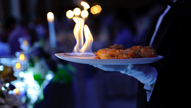
One of the most important parts of a restaurant website is the photos. They should be high quality and well composed and they should make your food look as delicious and appealing as possible. It’s a good idea to have a professional photographer take the shots, to make sure that they are just right. If the photos on your website right now don’t portray the food in the best light, why not take new ones?
Also, be sure to add in photos of the atmosphere and the people as well as the food. You want to show that people come to your restaurant and have a great time, which will encourage others to do the same.
Add a Map
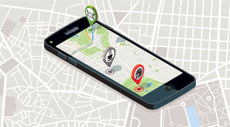
You might have your restaurant address on your website, but is there a map that shows the most efficient route for getting there? Sometimes people might not recognise an address, but a map gives them a much better sense of where your restaurant is located so that they can find their way there. There are plenty of ways that you can add a map into your website with an interactive plugin, so that the viewer can even zoom in and out.
Make it Mobile Friendly
When you view your restaurant’s website on a mobile phone, is it well designed and easy to use? Websites that are not mobile responsive will be difficult to navigate on a small screen. When your restaurant website is responsive it will look different when it is viewed on a smart phone or a tablet. It will be easier to navigate and all of the important elements will be resized and better suited to the small screen. If you know that your website isn’t mobile-responsive you can contact a web designer who will be able to create a version that will be easy to navigate on mobile.
Add Social Sharing Buttons
Another way that you can improve your restaurant website is to make it easy for your visitors to share the content on their social networks. If you have a gallery of images depicting your food there are buttons that you can use that allow visitors to share these images on Pinterest with one click. You can also add a box on the website that shows your most recent Tweets and encourages your visitors to follow you on Twitter. Harnessing the power of social media is a great way to spread the word about your restaurant.
These are just a few of the ways that you can improve your restaurant website. Take a good look at the current website that represents your restaurant online – is it really the best it can be or could you make a few changes to make it even better?


